


How I Built a Capsule Wardrobe That Actually Sparks Joy (Not Boredom)
I gave myself permission to break the #1 rule of capsule wardrobes: Make it a no-brainer. Scroll for resources.

Do capsule wardrobes have to be soooo boring?
(Incoming rant, but I promise this is leading somewhere.)
It feels like the rule of building a wardrobe is that you have to start with half a closet of boring yet versatile basics before you can get on to the fun and good stuff, like taking English Comp I and II as prerequisites to American Soap Operas or Lit Hop.
When I started rebuilding my wardrobe, I worried that if I went with what I thought a capsule wardrobe was supposed to be, I’d look like everyone else.
Black, navy, gray, brown, tan.
Feels like a school uniform dress code meant to minimize self-expression so you won’t disrupt.
(Side thought: Why do experts encourage wearing these neutral colors with the argument that they’re timeless? People have been wearing red for 40,000 years. That’s timeless!)
The pros and cons of neutrals in a capsule wardrobe
To be real, neutrals are valuable for many people. In US, Canadian, and European societies, they help people blend in, avoid unwanted attention, and achieve social acceptance. Many style experts promote neutrals as an instrument of ease—they’re supposed to make getting dressed a no-brainer.
Personally, I’ve had enough of checking out when I get dressed. It just doesn’t feel whole.
Getting dressed is my first chance to do something for myself every day before I spend eight or more hours doing things for everyone else. I don’t want that moment to be a no-brainer.
I want my brain to light up.
So I set out to create a capsule wardrobe that delivers versatility and everyday ease, built around color.
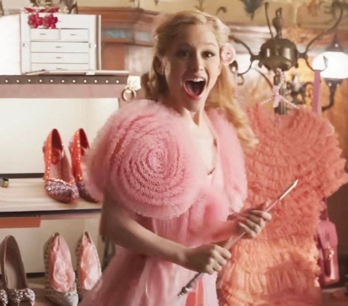
Dopamine dressing: I’m here for it.
3 steps to a colorful capsule wardrobe
You may remember I experimented with color in a travel capsule wardrobe. I liked how it worked. To make color foundational to my post-weight loss wardrobe, here’s the plan I created.
Step 1: Study what I’d been pinning.
I can’t say I have a unique approach to using Pinterest. (Are there any?) But I stepped back to look at what I’d been pinning to see how it could inform my personal approach to color.
I noticed I liked the way favorite style icons used color:


And I saved a few pics that mimicked what I saw colleagues wear that made me think, “That’s smart… I wanna wear that combo!”


My themes: color blocking, monotone and tonal outfits, and interesting print mixes.
Step 2: Decide on some colors to start with.
Whether or not you’re a fan of seasonal color analysis (my mom swore by it, but I like the freedom to color outside the lines), I found it a helpful place to start.
My online DIY color analysis gave me a color palette for dark winters with nearly 70 colors.
Still too many!
To narrow it down, I thought about:
How people react when I wear certain colors
How I feel wearing certain colors
Things I associate with different colors
This led me to some of the first moments of personal self-discovery through style. Choosing colors that allow me to show up the way I wanted prompted me to think about how I wanted to show up.
For my work clothes, that’s as a creative professional—for me, classic lines, bold colors.
I settled on starting with a few lavenders, blues, pinks, and greens:
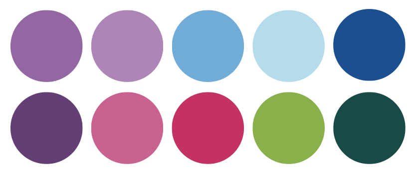
I decided to start with solid color pieces in these colors to mix and match for monotone, tonal, or color-blocked outfits. I’d choose stuff so I wouldn’t look too Ann Taylor. Then I could add some fun prints, or introduce other colors later.
Resources:
I did my own online seasonal color analysis after reading articles at The Concept Wardrobe and downloaded a color palette for $20. Wardrobe palettes and outfit combos are available for extra. Online results aren’t as accurate, and I’ve seen mixed reviews. But I’m happy with what I got for the money. Of course, there are plenty of color analysis apps. If you want to work with a consultant, Color Me Beautiful (the company that started it all in the ‘80s) has an online consultant locator to find someone local to you or set up a virtual consultation. Expect to pay $100 to $800.
Step 3: Now bring in some neutrals (if you want them).
So now, my capsule wardrobe is not neutrals first and emphasizes what I love. I can use neutrals for balance. I went with white and navy, plus the gray and pale pink I put into my travel capsule wardrobe. I’ve seen navy and pale pink called “the new neutrals.” They both work with the colors I wanted in my capsule wardrobe and give it more versatility.

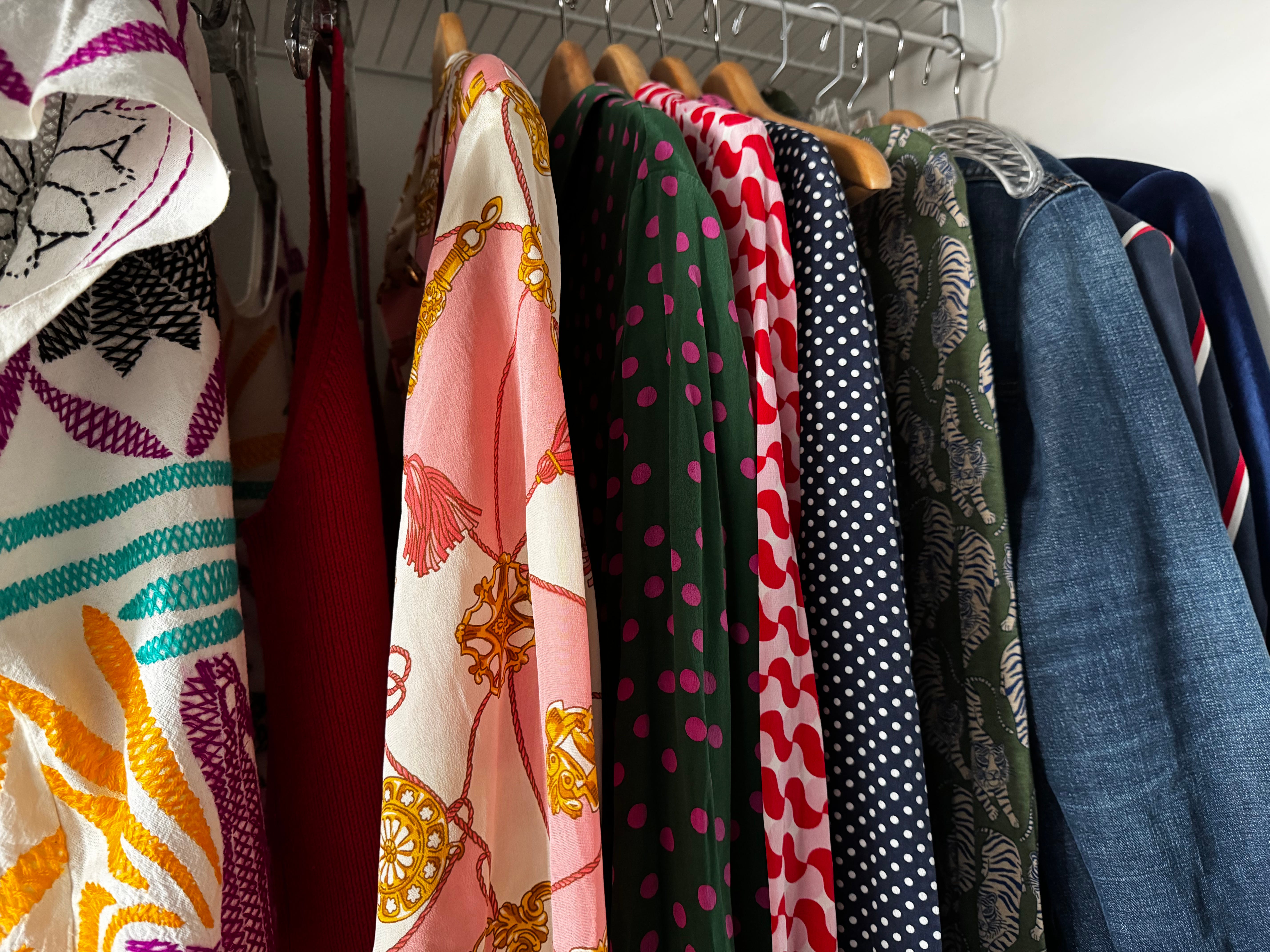
And some of the pieces I purchased:


Resources:
I bought a lot of my colorful pieces from Boden and ThredUp. For more, here’s a list: 20+ Colorful Clothing Brands You Need to Know About from the newsletter Statement Wall.
For more on using neutral colors to elevate or relax a look, read Meet Your Unsung Color Heroes, recently posted on The Found Journal by stylist Angie Uh.
So, how’s my colorful capsule wardrobe working out?
It’s small—and I’m liking it! Three things:
I’ve had a hard time finding pieces I like in the purples and lavenders I chose.
I’ve added a little red and pale yellow. So far, I keep everything aligned with a dark winter color palette.
I deviated from my shopping plan: I found some prints and patterns I didn’t want to pass up. (See the photo at the very top.)
But after getting just a few pieces, I found myself experiencing something I hadn’t ever before: Most days, I look forward to getting dressed.
I still have more I want to do with my wardrobe. But after decades of hating shopping and rarely feeling happy in my clothes, this is a major win.
If you know someone who would enjoy this, please share!
Re:dressing is a free newsletter I publish every other Tuesday.
My goal with re:dressing is to build a community for people who want to grow and feel confident about expressing themselves through style after weight loss and other physical and life changes. Subscribe to stay connected.
Thanks for reading!
I love this! I feel like while I'm aspirationally stylish, I am also a lazy artist type. This will truly help me, Shaun. Truly! And I love the idea of starting with solid colors and going from there.
I love Dopamine Dressing as a name, if it isn't already taken! Or something like Fly Feels...